See, I said I'd keep going.
This is a continuation of my discussion/explanation of the why and how behind my design
at this blog. (Part 2 is
here, Part 1
here).
Today's discussion? Vectors.
Most images you see around the internet (if not all) are what's called bitmap images. These images are composed of, essentially, a map of colored dots, or pixels, that all form the image. The way that bitmap images are composed means that when you enlarge them, all you're doing is enlarging the pixels, so the result you get is a blocky, or 'pixelated' image. Vector images are different. Instead of creating a line by putting one pixel after the other, after the other, vector images create a line by using math, an equation, which tells the program that this line should be so wide, should start and stop with this length/proportion and should be this color. Because of this, you can endlessly enlarge vector images because the equation stays the same, you're just proportionally increasing the numbers in the equation. Okay, so thats how I understand it to work, anyway, but I haven't had math in years, so I'm a bit mathematically challenged at this point.
Anyway, the point being that vector images can be much sharper at every size than bitmapped images because it's relying on math instead of a colored sequence of pixels.
Because of this quality, I wanted to create the swooshes and swirls for the background design as vector images, both so I wouldn't have to worry about the rough edges from my pen marks, and I could make sure it was much more even. I wanted my circles to actually be circles, instead of my shaky hand's approximation of circles. It also allowed me to have consistent line widths where I wanted it - and over all, just have much more control over the forms.
Unless people are curious, I won't go into the intricacies of how exactly I created the image via vectors. Lets just say I made use of lots of circles and ovals as guidlines for myself.
The headline was also vectored - but for that, I wanted to incorporate Art Nouveau typography (which was very flowing and hand done. Made to fit the specific area) But I also wanted to tie the background into the header to make them relate to each other - but I didn't want it to just be text stuck inside a border.
I tried several sketches before coming up with one I could work with.
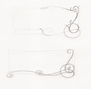
I started off with only partial borders, encorporating the same kind of swooshes and spirals in the background, but they weren't quite working for me. So I tried again.
I found this one to be more in the direction I was looking for, so I decided to run with it. I had to change the dimensions from my sketch in order for it to be the right size for the header, and some other changes and additions were made during the vectoring - but that tends to happen anyway.
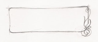
Here's the final header:


